Wesen
Turning customers into creators
I built an intuitive 3D customisation tool which enables anyone to create and order their unique pendant necklace.
Responsive web app
Individual project
- UI/UX Designer
- Full-stack JS developer
2018
Responsive web app
2018
Individual project
- UI/UX Designer
- Full-stack JS developer
Recent years have seen a gradual increase in awareness of product customisation and on‑demand manufacturing. Yet we can still see little evidence of the promised revolution due to high prices and limited use-cases. In 2015 I helped pioneer customisable children’s toys at Makielab. We enjoyed modest success, catching the attention of Disney who eventually bought the startup. My intention with Wesen was to leverage the lessons learnt and push the envelope of consumer Mass Customisation software.
I wanted to explore the possibility of a playful, lightly constrained creation experience, able to generate infinite variations while being intuitive and fun to use. I was convinced that suitable constraints could enhance the creativity of users, rather than restrict it. I also wanted to completely automate and outsource the fulfilment process.
By building a product end-to-end, I also hoped to increase my empathy for colleagues and stakeholders. To re-experience digital product development from every perspective - founder, marketer, product, design, developer and operations.

Section 1 of 3
Discovery
# Research
I chose a product category by balancing estimated market size and product-market fit.
To gauge the market size, I borrowed research techniques from digital marketing. To identify a potential user, I conducted qualitative interviews; four designers and one non‑designer who had each recently designed or commissioned bespoke jewellery.
Jewellery balanced market size and technical constraints
Search keywords paired with customisation typically focused on personal appearance and self expression. Jewellery was among them and tends to be small, high value objects suitable for 3D printing.
People were talking about customisation and personalisation
Search keyword volume was marginally higher for personalisation. Few people were signalling a desire for 'creative expression'. This signalled a risk, but also an opportunity to unlock demand and rank for niche search queries.
Customised and personalised products tend to be gifts
Based on competitor website messaging. Gifting remains highly seasonal, with a shift to mobile. Google Consumer Barometer (2018) suggested more than 50% of fashion and accessories gift purchases were on mobile.
Customised gifts looked like a growing trend
It wasn't hard to find designers in my network who had recently given a customised gift. They shared anecdotes suggesting a growing trend.
Non-technical people felt daunted by customisation tools
Designers found the process of making their gifts empowering, while non-designers found it initially daunting and later frustrating. Sometimes they looked for expert help.
Pendants seemed more suitable than rings
The majority of gifts among my interviewees were rings. Pendants came in second place. However, with rings, I foresaw difficulties such as sizing and gemstone fixture.
I couldn’t find anything like what I imagined. In the end, designing it myself really paid off. They found it so thoughtful!
Interviewee discussing gifting jewellery to their partner
# User persona, scope and objectives
In order to complete a pilot in a reasonable timeframe, I kept a tight scope, with clear objectives and success criteria. Qualitative interviews suggested tech enthusiasts looking for unusual gift ideas as the primary user persona. These interviews also revealed key challenges, which I captured as 'How Might We' statements.
# Gifting friendly
How might we communicate the value of lightly-constrained product creation to an audience that currently isn't explicitly asking for it?
How might we address the anxiety of non-technical users approaching a customisation interface?
- Build confidence with an e-commerce storefront that explains the value proposition.
- Allow shoppers to browse pre-designed products and start customising from there.
- Address anxiety with an intuitive interface that can be learnt within 5 seconds without a tutorial.
- Minimise the number of controls and progressively disclose supporting features.
# End-to-end
How might we build an end-to-end product, which enables customers to buy their creations, while minimising development effort?
- Enable customers to purchase their creation and automatically fulfil their order.
- Save the customer's design and order data, allowing them to return to it and make modifications or repeat orders.
- Establish a line of communication for customers to enquire about their order and report any problems.
- Minimise technical and operational overhead by following an 'outsource-first' principle e.g. third-party cloud services, APIs, payment providers, fulfilment experts.

Orange indicates features to be outsourced or removed for the pilot.

# Low-fi Prototyping
My background in Industrial Design helped me assemble a list of promising 3D modelling tools. I extended it with input from designers in my network.
The search for a compelling customisation experience required an iterative approach. I reimagined each tool with simplified interaction or constrained capability. Then I would combine several such tools to see if interesting synergies emerged.
To formalise my thinking, I rated these ideas on Expressiveness and (ease of) Implementation. During this process I began thinking of myself as 'unshackling' expressive modelling tools from their specialist software confines.
# Blender basic interactive
I chose to proceed with an idea combining Radial array and Control geometry. It was fun to use, often producing pleasing and unexpected outcomes.
Blender had proven a useful platform for experimentation. But I wasn't able to use it for usability or value testing because my subjects weren't fluent in the Blender interface.
# WebGL basic interactive
To overcome this limitation, I built a basic yet functional prototype in WebGL. I also took the opportunity to explore various JS libraries before committing in production.
All testers immediately recognised the affordance and moved the control points. I observed an attitude of curiosity, even among those I expected to be daunted by the interface.

# WebGL feasibility
I had a growing concern that customers could feel disconnected from the product they would eventually buy.
To mitigate this risk, I prioritised reaching a high level of graphical realism. Matcap shaders offered a solution that also met my performance requirements.
# Lessons from user testing
Before moving into high-fidelity design and development, I performed further usability testing on the proposed direction to validate design decisions, identify challenges, and iterate based on user feedback.
| Observation | Remedy |
|---|---|
| “I wish I could go back to the way I had it before” | I implemented an undo feature and reorganised the interface to accommodate the button |
| “I have no idea what size it is” | I added a scale grid and an introductory animation sequence, showing the pendant and chain in context |
| “These messages just get in my way” Error messages (further discussion below) broke the creative flow and led to a frustrating experience | Now the user only encounters error messages once they enter the eyelet mode for the first time, thereby signalling a desire to finish the pendant and checkout. I also made error messages dismissable until the next user action |
| “The first thing I wanted to do was push all the sliders to maximum” In some cases testers created the largest possible pendant | This signalled the need for another error condition - where the pendant design is unreasonably large - both too heavy to wear and very expensive. I also tried shrinking the design area but this felt constricting |


# E-commerce experience
Guided by my findings, I was confident the customisation tool was ready to be shaped into an e‑commerce flow.
At first I imagined a sequence of steps. I built mockups of increasing fidelity and continued to test with users. I employed a hybrid approach, mixing static screens with the WebGL prototype. But something was wrong; somewhere along the way I had lost the magic of the earlier tests.
Sculpt segments
Layout segments
Choose material
Place the eyelet
Details
Checkout
I switched from linear steps to 'modes' in an effort to address this, but my eureka moment came when I remembered that earlier prototypes featured none of this usability 'help' yet testers found them perfectly intuitive. Modes, albeit better than a steps, still just got in users' way.
Where they did add value was in separating the expressive phase of creation from the tasks necessary for completing the order, such as adding the necklace chain eyelet, ensuring the pendant was valid for 3D printing and filling out details.
# Input validation for 3D geometry
Offering users expressive tools introduced a challenging problem; how to ensure they create valid geometry for manufacture by 3D printing? Through user testing I identified four common error cases:
- The radial segments do not connect, so that the necklace is not a single volume
- The eyelet does not connect to the pendant
- The pendant blocks the eyelet so that the chain would not fit
- The pendant is overly large
I developed systems to detect each of these problems. The notification window begins by offering tips. Later, when appropriate, it reports geometry errors. I was aware of additional hard-to-detect problems such as non-manifold and thin geometry but I chose not to address them in the pilot since they rarely occurred, preferring to manually fix these models for customers.

Section 2 of 3
Delivery
# Production assets
Based on my wireframes and aided by the tightly scoped user journey, I was able to focus on visually designing a minimal set of interfaces and assets. Among my influences were the Airbnb Design System, Google Material Design and the design language of fashion and jewellery brands.

I created a series of SVG icons inspired by the Montserrat font.

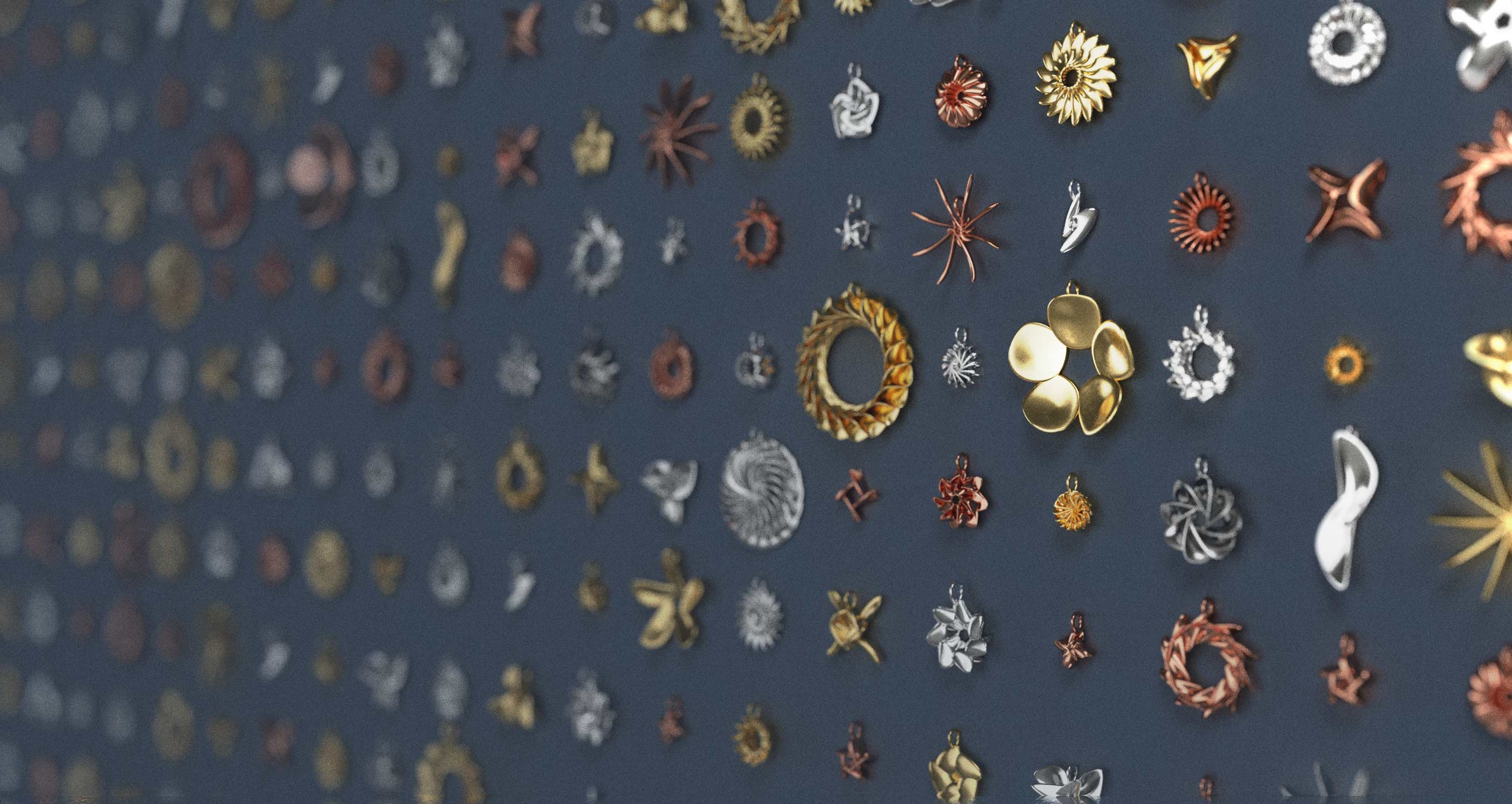
Photorealistic renders enabled me to show the variety of products possible.

# Development
As I investigated technologies to power the e‑commerce side of the experience, my main criteria was development speed. I wanted to avoid building common solutions like order management and payments. This led me to consider off-the-shelf platforms like Shopify and Magento. I found an even leaner solution. Shapeways (opens new window) (leading 3D printing web platform) offers an API with the capability to directly upload models to a private store hosted on their e-commerce platform. In this way, I could completely outsource checkout, payment and fulfilment. For further technical decisions, I drew on my experience at toucanBox and Makielab:
| Experience | Solution |
|---|---|
| Unity or Unreal are the de facto realtime 3D frameworks but they tend to increase the complexity of a web frontend build chain | Three.js is less fully-featured but perfectly serviceable for a simple 3D interface |
| Different 3D frameworks powering frontend and backend processing can lead to duplicated work and discrepancies between what the user sees and what is actually manufactured | Three.js can run the same code in the browser and on a Node.js server |
| Hosting websites and backend processes on physical infrastructure requires constant maintenance | Node.js / Express server on Heroku cloud infrastructure |
| User accounts can greatly improve the customer experience but they are a considerable technical overhead | Send unique content links (saved pendant and checkout links) by email. Conduct all CS using the same email thread |
Techstack
WebGL
Three.js
UI
Angular 2+
CSS
SASS, Bulma
Backend
Node.js, Express, MongoDB
APIs
Sendgrid, Shapeways

Section 3 of 3
Evaluation
# What went well
You can try the live app (opens new window) and order your pendant from Shapeways. Feedback from users suggests that Wesen is an intuitive and compelling customisation tool, satisfying my original success criteria; Gifting friendly and End-to-end. A proportion of Wesen's audience don't consider themselves creative or technical. I also significantly expanded my skills, building deeper empathy for my product and engineering colleagues.
# Lessons learnt
Although business success was never my primary goal, I was still somewhat disappointed that Wesen didn't exceed modest reach. This was, however, what my initial market research suggested. Were this to be a priority in any future venture, I draw an valuable lesson: the importance of working in teams.
Building a product oneself is empowering, but it's also inefficient and risky. For a start, I'm not a natural marketer or sales person. Getting the word out is critically important to product success. Diverse perspectives lead to better products. Specialists get things done better and faster. Correspondingly, I intend to build teams for any future projects at this level of resolution.
# Going forward
Wesen is no longer under active development. Possible next steps include adding gift-card capability, revisiting the value proposition and running a concerted marketing campaign. If that looked promising there are several other dimensions of the e-commerce experience which could be improved (e.g. reviews, testimonials, user generated content), as well as adding more jewellery types to the platform.

Avg. load time for the realtime 3D customisation experience
Starting price for a unique pendant in plastic
Unlimited variety