toucanBox
Refining the onboarding flow
I guided the organisation through a human-centred design process which had a transformative effect on our approach to product development.
Responsive web app
- CTO
- 2 full-stack developers
- Project lead
- UI/UX Designer
2017
Responsive web app
2017
- CTO
- 2 full-stack developers
- Project lead
- UI/UX Designer
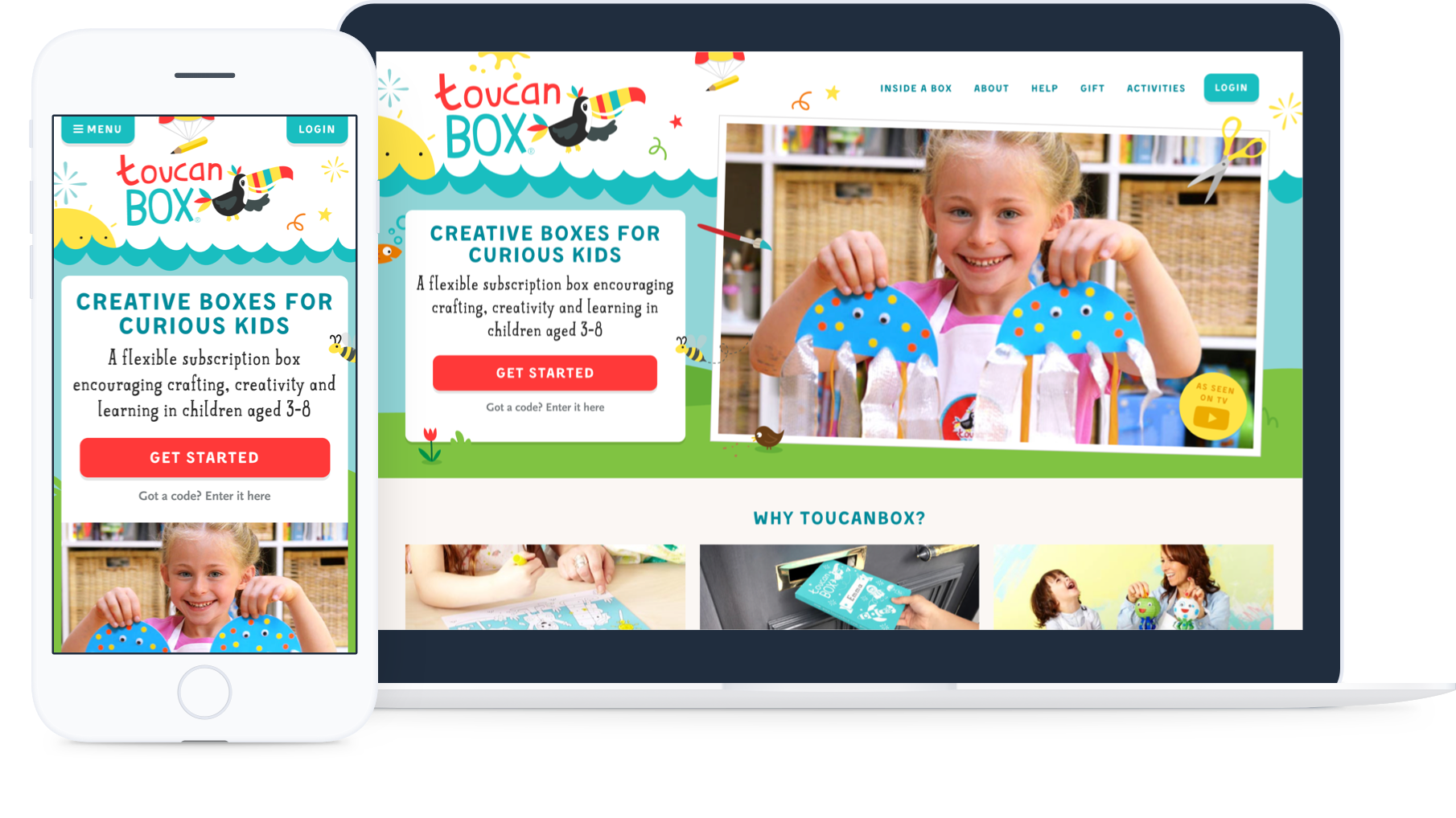
toucanBox is an award-winning startup subscription service delivering creative craft boxes to children aged 3-8.
Each toucanBox is addressed directly to the child and contains all the materials needed to complete crafty projects, with colourful step by step instructions and an activity magazine. New customers register through the website.
We secured funding in mid-2016 and were ready to scale our operations. Although toucanBox had firmly embraced an online-first business model, we weren't thinking about our product in a holistic way that included the online experience. Our scaling roadmap didn't include significant work on the user-facing portion of our web platform. As the only (digital) product person in the company, I knew it was up to me to change the mindset.
My breakthrough came when I discovered our average funnel conversion rate lagged behind that of other comparable subscription businesses. From this I could derive a clear and compelling expected ROI - and so I gained my mandate.
As project lead, I guided the organisation through a human-centred process of research, content strategy, business alignment, user interface and interaction design, usability testing, and web development.
# The challenge
How might we increase funnel conversion rate; achieving our business goal but also helping our customers achieve their goals. How might we build a shared organisational understanding of the customer journey.
# The outcome
A usable, reassuring, and technologically sustainable homepage and signup experience which raised funnel conversion rate by 25%.
I have omitted confidential information in this case study.
Section 1 of 3
Discovery
# Research
I tested the usability of the existing flow and engaged both customers and non-customers in a dialogue to uncover core motivations.
To supplement this, I collected data insights and stakeholder knowledge from across the business; customer service (CS), website analytics, net promoter score (NPS), customer surveys and the production database, sometimes asking new questions of our data to fill in the gaps (including writing a few database queries of my own). Along the way, I captured insights in a central location accessible to the whole organisation.
Prospective customers are usually on their phones
85% of users accessed the website on mobile or tablet. The most common source was our social media ads.
Dropout after partially completing signup was surprisingly high
A significant proportion of dropouts occurred near the end of the details form, at the payment section.
We were pushing users into the signup funnel too soon
Many of the signup dropouts returned to the homepage and eventually converted.
It wasn’t clear in our messaging that we offer a subscription
This was a frequent complaint. On average, users only spent 30s on the landing page and 75% didn't scroll far enough to find key information.
We needed more box imagery showing breadth of the range
This was the most common theme in user and prospect interviews. It was a strength that we weren't leveraging.
Lack of feedback that a trial code was applied caused anxiety
I was aware of this from complaints and testing. It was the cause of the strongest negative emotions I encountered.
It’s fun, I can see it’s for kids. But I can't see straight away why I might want it or how it works.
Ameera, mum to Rafi
# Who are our customers?
Through internal stakeholder consultation and customer interviews, I identified the following high level personas and their corresponding motivations:
# Parent
Buyer persona
In general it’s the parent who responds to our advertising and comms, makes the purchase, manages the subscription and engages with customer service.
- I want my child to be happy
- They enjoy crafting “We do crafts every weekend and they love it”
- They want toucanBox “They saw it on TV and asked me for it”
- I want to be a good parent
- I want to share positive experiences with my child, forming lasting memories “I really value the time we spend together”
- I want to support my child’s education and development “If only it was easier to find things for my kids to do that support their education”
- I want to be prepared “I want to do more crafting with my kids but I’m not creative”
# Gifter
Buyer persona
A family friend or relative. Possibly already a customer.
- I want to give a good gift
- I want to show how much I care “Finding a gift that’s good enough can be hard”
- I want it to be quick and easy, for me and the recipient “A good gift doesn’t create any work for whoever I give it to”
# Child
User persona
The box experience is all about the child. Their enjoyment drives the decision to remain subscribed. They want to be entertained or to do what they've seen on TV or tried at school.


The toucanBox fulfilment warehouse at Heathrow
# Collaboration and objectives
Internal stakeholder engagement was crucial to understand the overarching business goals and challenges, but also to build a sense of ownership in the project outcomes. I needed to establish a 'product mindset' around the online experience, so that we would continue to measure, evaluate, and iterate the platform on an ongoing basis.
I involved key stakeholders in a journey mapping workshop to visualise the front- and back-stage activities comprising a subscription. This equipped me with important foundational knowledge but also helped other departments empathise with the customer. I followed up with a second workshop, this time focussed on optimising the core value proposition, messaging and content hierarchy. We used our new mission statement as a starting point: “Unlocking your creativity one box at a time.”
I summarised our insights into six 'Product Principles' each with suggested ideation starting points:
1. Easy 2. Clear 3. Trustworthy 4. Open 5. Personalised 6. Flexible
We agreed the first two principles were most relevant to our goal of increasing conversion rate. This focus enabled me to define clear measures of success through general and channel-specific KPIs.
# Make it clear
Refine how we communicate the toucanBox value proposition with messaging and content optimised for fast comprehension.
Minimise misunderstanding and effectively translate our typical marketing messages “free craft box” into the full picture “toucanBox is a craft box subscription you can try for free”.
Reduce anxiety about price and discounts by providing clear and timely feedback.
# Make it easy
Enable comparison between the three box sizes.
Minimise the number of steps, clicks and details required to complete signup.
Build confidence throughout the funnel by following usability best practices, validated by thorough user testing.
Establish a consistent UI language with a living design system.
I gathered everything we learnt about our users into a set of 'Product Principles' the whole organisation could access and benefit from.

# Testing prototypes
Equipped with strategic objectives generated with input from across the organisation, my next step was to iterate towards a design solution.
Four design challenges stood out as critical to the project’s success; the 'main stage', product section, site navigation and the details form. I didn't rely solely on upfront research and tested continuously with stakeholders and users. NB: trialist mode is activated when a user enters a valid discount code or if they arrive from a paid marketing source with a URL embedded code.
# Landing page
# 'Main stage'
Leveraging our newly optimised messaging to communicate the value proposition clearly and quickly.
- Clear upfront product value statement
- Leveraging our quality video content (autoplay on desktop)
# Product section
Enabling comparison between each box, while emphasising their different propositions.
- Compact vertically stacking cards with detail views
- Not neglecting desktop users - three column layout

# Information architecture
Redesigned sitemap and site-wide navigation, able to accommodate existing content and scale to new verticals.
- Always visible login button to reduce CS cases
- Links that focus on what prospects are trying to learn
# Signup funnel
# Reassuring information
Single page signup form, the simplest and most usable solution we could currently offer the user.
- Clear feedback of discount and price status
- Customisable trial offer message
- Revamped input validation logic
# Mobile-friendly steps
Splitting fieldsets onto separate pages (mobile and desktop) with a continue button and persistent order basket.
- Could be more usable on mobile and enable more information capture for personalisation
- Beyond the current technical expertise of the team
# Build your box
I experimented with adding additional choice at signup but found this reduced conversion rate. A small uptick in retention didn't offset the effect.
- Upsell customers at signup
- Retention was a promising future focus
- Too much upfront choice for most potential customers
# Lessons from user testing
I conducted usability testing of the funnel designs with internal stakeholders and external testers. The appropriate level of fidelity was different for each initiative and audience. Static wireframes and paper prototypes sufficed for internal stakeholders, greatly increasing iteration speed. For external testing I typically made use of inVision and HTML prototypes, recording sessions by video to be viewed later by the whole project team.
| Observation | Remedy |
|---|---|
| “I’ll use the menu to learn more” A significant minority of testers wanted to use the navigation menu to learn more, rather than scrolling. They found the options unsatisfying or confusing | I added links to the main navigation for separate pages mirroring and expanding upon scroll-reachable content on the homepage |
| "We can't just have the burger menu on desktop" Internal testers requested an always-visible main navigation on desktop | I had de-prioritised this for expediency but quickly realised we weren't meeting users' expectations while it was absent |
| “How do I close this?” Testers expected the product details modal to have a close button at the top as well as the bottom | I added close buttons to the top and bottom of the modal |
| The view rate for the toucanBox promotional video didn't increase, even though I had increased the prominence of the video button | Further emphasis on the video button might compete with the main CTA. Instead, I added an autoplay looping montage video on desktop |


Section 2 of 3
Delivery
# Design system
With such a small technology team and a rapidly growing business, I knew it was crucial to utilise every opportunity to maximise efficiency. We still had a relatively small web platform, so it made sense to establish a living design system during a redesign.
I worked closely with developers as we followed the Atomic Design (opens new window) methodology, with code as the single source of truth. I separately maintained a minimal Sketch Library of atoms to facilitate rapid UI sketching. In support, I directly wrote CSS for variables, atoms, molecules and some organisms.
Going forward, the design system enabled developers to prototype UI and the establishment of the 'Activities' blog, where content writers could easily compose visually rich articles.

# Visual design
The toucanBox Creative Team had recently completed a brand refresh. I knew this new style would give us a distinctive look online and I was keen to promote consistency across all product touch points.
Having been involved in the earlier stages of the project, they were primed and ready to work with me to apply the brand to the UI.

# Development
Guided by the findings from usability testing, we were sufficiently confident in the selected initiatives to move into development.
I prioritised ruthlessly, dropping design concepts which didn't perform. This was particularly important since developer time was severely limited. Both the customer facing and back-office aspects of the business were relying on their effort. The bottleneck was partly due to our highly custom Ruby codebase and the difficulty at that time of hiring Ruby specialists.
Being embedded in the technology team, I was able to compliment the handoff by being available for questions and followup. This was particularly important for tuning specific user interactions like input validation or fixing emergent UX problems like missing URL encoded discount codes (we moved to a session based system).
Techstack
Build
Middleman, Gulp
UI
JQuery, Vue.js
CSS
SCSS
Backend
Sinatra (Ruby, ERB), Postgres
Section 3 of 3
Evaluation
The new signup experience had an immediate impact on funnel conversion rate.
To gain granular information about the effect of each initiative, we built and released sequentially with A/B tests and qualitative evaluation.
# What went well
The collaborative research and discovery phase had a transformational effect on the broader organisation. In response to the challenges and insights uncovered, other teams rolled out significant changes to their business processes and activities, adopting a 'product mindset'.
# Lessons learnt
It took rather a long time to complete the process and access the valuable outcomes. As the only full‑time member of the project team I needed to split my time between management and UX design. Although I relished the varied work, combined with the developer bottleneck, the delay between identifying problems and applying remedies was costly. We agreed to address this issue by hiring a specialised front-end developer and a product manager.
# Going forward
In this project I focussed on giving customers a strong reason to start a toucanBox subscription. The greatest potential going forward lay in giving them a strong reason to stay. This meant tackling the two remaining principles, Flexible and Personalised, in a future project focussing on customer retention.
I created a static mirror of the toucanBox homepage at the conclusion of this project in 2017.
Cumulative average increase in funnel conversion rate
Reduction in homepage data transfer. I implemented SVG spritesheets, lazy loading and progressive enhancement
Reduction in the number of CS cases relating to a misunderstanding of the value proposition